

Overview
Websites created with a built-in language toggle aren’t common, and the design for Gloria’s Tex Mex Cafe dives into integrating this tool to improve easier website access for their Spanish-speaking audience. This project researches the 2 main target audiences’ needs and combines them to create a more accessible online experience.
Role
UX Research
Information Architecture
UX/UI Design
Responsive Web Design
Tools
Figma
FigJam
InDesign
Illustrator
Deliverables
Gloria’s Tex Mex Cafe Visual System
High-Fidelity Design of Gloria’s Desktop, Tablet, and Mobile Homepage
High-Fidelity Design of Gloria’s Online Ordering Page
Empathize
New Possibilities
Gloria’s Tex Mex Cafe is a local cafe that has been open since 2001. It serves many customers who feel more confident navigating in Spanish, but its current website is only available in English.
While Gloria’s food and in-person experience are highly rated, the digital experience is lacking in accessibility to the Spanish-speaking community. This revealed an opportunity to create a bilingual website.
| Success Metrics | Target |
|---|---|
| Spanish Language Toggle Usage | 25% |
| Successful Mobile Order Completion | 90% |
| Catering/Blog Page Engagement | 20% |
| Increased Online Orders | 20% |

my goal
- A responsive website update will open accessibility to Gloria’s customer base
- This will help Spanish-speaking community members confidently browse and place online orders
- Success will be measured through evaluating task completion rates and increased online engagement

methodology
To better understand visitor and business needs, I reviewed the existing website structure and identified where language barriers and usability issues could impact ordering.
Personas
Designing for 2 different audiences was key to meeting our revenue generation.
Primary Audience
Spanish-Speaking Community Member
This segment values familiarity and clarity when ordering food for themselves or their family. They often support local businesses and feel more confident using digital experiences that offer Spanish language options.
Pain Points
english-only websites
fear of ordering incorrectly
unclear menu item translations
low confidence during checkout

user needs
Spanish language toggle
clear Spanish menu descriptions
accurate translation into Spanish
confidence before checkout
secondary audience
Busy Local Professional
This segment is frequently balancing work, errands, and daily responsibilities. They value speed, convenience, and reliability, often using mobile devices to place quick pickup orders during lunch breaks or after work.
Pain Points
not being able to order online
unclear pickup wait times
poor mobile usability on the go

user needs
ability to order online
accurate pickup time
mobile responsive design
Define
The Problem
The existing website creates barriers for Spanish-speaking visitors trying to place online orders and learn more about Gloria’s recipes and events. As a result, customers may rely on in-person questions or phone calls for information that should be easily accessible online.
Accessibility

bilingual access

MOBILE-FIRST USABILITY

CLEAR CONTENT HIERARCHY
Constraints
Due to project resource limitations, collaborating with a native Spanish translator during this phase was not possible.
Instead, Spanish content was generated using an AI tool to keep the messaging clear and natural. Future iterations would benefit from validation by a professional translator or native speaker.
For the purpose of this project, only the mobile included a prototyped Spanish-to-English toggle to be used as a reference.
Ideation
Problem Framing
I used How Might We statements to translate research findings into clear opportunities for Gloria’s bilingual redesign. So, how might we….
- help Spanish-speaking visitors confidently browse menus and place orders online?
- create a mobile-first online ordering experience?
- support business growth through clear calls-to-action for catering and pickup orders?
Content Model
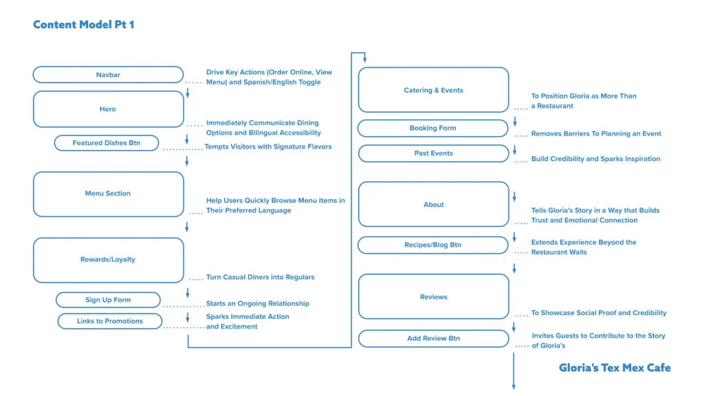
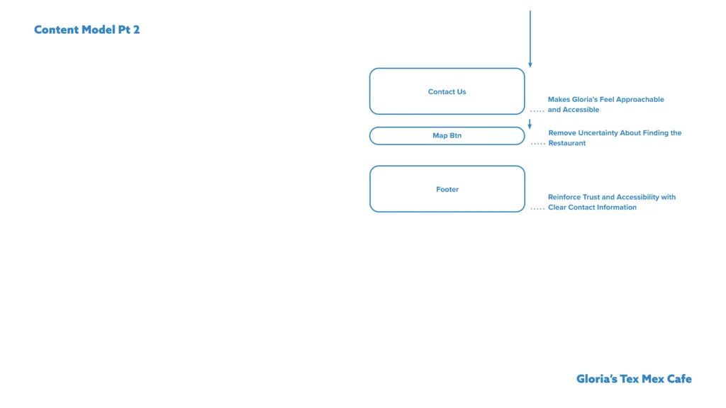
The homepage content model was structured around the project’s success metrics so each section contributes to measurable outcomes. Stakeholder priorities were also integrated to align user needs with business goals.
Low-Fidelity
Design Decisions
The order of sections changed from the content model as I created the low-fidelity wireframes to align more with business goals.
For example, the rewards and loyalty moved to the navigation and footer, preserving access without competing with higher-priority tasks.
Implementing business goals
- Spanish language toggle placed in the header and footer for immediate bilingual access across key pages
- The order page includes a simple ordering process to not confuse users
- Catering, events, and recipes support business growth beyond standard orders
- There are no dead ends for users; each section has a clear call to action, such as prompting the visitor to order


Design
V.1
Design Insights
Mobile Homepage Page
- “To better visualize how someone would place an order, can an order page be created?”
- “Will both audiences understand the content?”
- Order Online and View Menu buttons could be moved to the hero section, so the navbar doesn’t take up so much space
- “How can I reorganize a featured dish’s image and description to feel less separated?”
- Slider arrows are typically placed on the left/right side of the scrolling content
- Blog cards can be narrower, and have the new card “peaking” out the side to symbolize additional scrollable content
- The arrow with these cards can be removed with this logic
- Keep content inside the wrapper, unless purposefully extending the content to the edge
- About Us section could have a call to action to keep readers interacting with the site

Problem Framing
The progression to Version #2 started off with HMW’s to guide new iterations. So, how might we…
- make the site more accessible to both audiences?
- group relevant content better together?
- organize an ordering page that would give users more confidence with what they are buying?
V.2
Homepage and Ordering Page Design Decisions
user need
Spanish language toggle
accurate translation into Spanish
clear Spanish menu descriptions
confidence before checkout
accurate pickup time
mobile responsive design


design solution
visible header + footer language toggle
Strings, modes, and appearances for language consistency
scannable menu text paired with imagery
clear pricing and familiar order patterns
Pickup times shown before cart
44×44 touch targets + responsive layouts
Functionality and UI Patterns
- This list is shortened, and the top items are highlighted
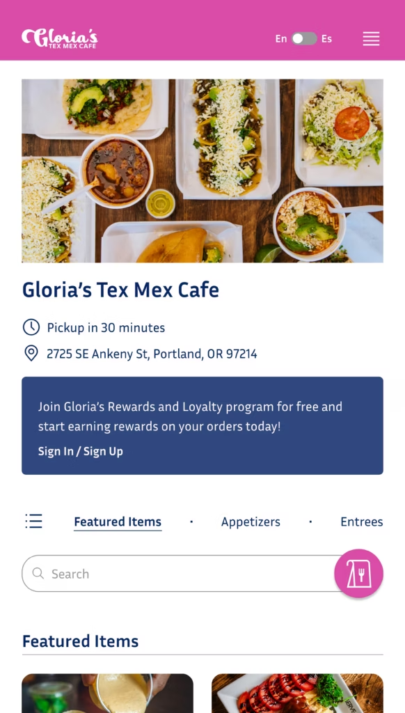
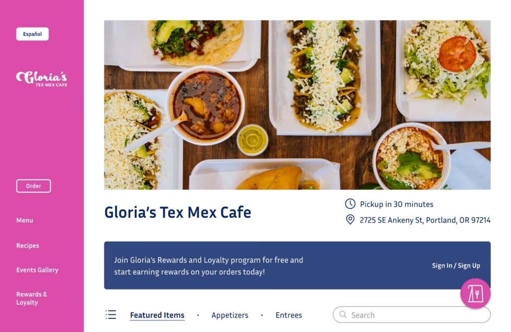
- The floating action button brings attention to what would happen when you add an item to the cart on the order page
- The users would be directed to another page to modify their order when they add something to their cart. While I didn’t design this, I thought about what happens back on the order page once a user adds something to their cart! They would need the floating action button with a small notification attached to see how many items they have, and checkout by clicking it.
- The order page is intentionally simplified to reduce distractions and support task-focused behavior
- Unlike the homepage, the order page prioritizes clarity, scannability, and quick selection through structured layouts—while maintaining brand consistency through color and typography
- Rewards and Loyalty sign-up is mentioned on the order page, since it’s most relevant at the moment users are actively placing an order and are more likely to engage with earning or redeeming rewards.
- Pink was slightly desaturated to reduce visual harshness, aligning the brand with a more authentic, less overly “commercial” aesthetic.
- Order page menu items are grouped based on proximity, making the separators between items a supporting feature
- In the uncontrollable circumstance that an image doesn’t load, users will still know what the menu item is
Version 2 Homepage

Version 2 Order page

Test
Usability Testing
Adding the Spanish to English built-in translation in Version 2 has its benefits for our users. However, how can we be sure that this will make sense to our audience?
To test this, I conducted usability testing with 3 participants. 2 could be identified as our Spanish-speaking community members, and 1 could be identified as our Busy Local Professional.
For the purpose of this project, only this one key task was assigned to participants, with success rates evaluated and insights synthesized based on their actions and feedback.

| TASK | SUCCESS RANKING |
|---|---|
| Switch languages of the website | 100% |
follow up questions
Open-ended questions helped uncover user expectations and areas of confusion, while a closed-ended question was used to quickly validate the visibility and discoverability of the language toggle.
- Open: What did you expect would happen when you switched the language?
- Open: What, if anything, was confusing about this experience?
- Closed: Did you notice the language toggle/button right away?
Key Findings
- The language toggle was easily discoverable for all participants
- All 3 participants successfully located and used the toggle without assistance, indicating strong visibility and clear affordance—even when starting in Spanish
- Spanish-speaking participants felt comfortable with the default Spanish experience
- “This already makes sense to me! I wouldn’t need to change anything”
- The English-speaking participant relied on the toggle immediately
- “I’d look for something to change the language… oh, there it is”
Implement
Success!
With our language translation validated, there seemed to be no changes that needed to be made in terms of the toggle and button option.
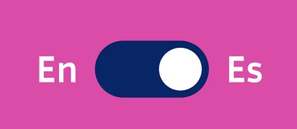
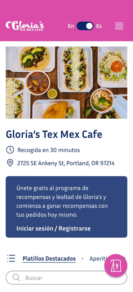
- The toggle switch/button caters to both audiences
- Spanish is the “active state” since communicating with stakeholders and analyzing research showed Spanish-speaking users are more commonly viewing the site
- A toggle is used on mobile and tablet for a space-efficient way to switch languages, aligning with common touch-based UI patterns
- On desktop, this shifts to a button to improve clarity and discoverability, as clickable actions are more explicit and easier to scan in larger layouts
Mobile View
Tablet View
Desktop View
I purposefully only tested the toggle to cater to our primary Spanish-speaking audience (the primary audience). In the future, testing would be conducted on other tasks, such as navigating the homepage and placing an order.
Handoff

Final Design
Final design Homepage
final design Order page
Outcome
Reflection
More time to build out the order page would have been ideal. Nevertheless, I thought about how the ordering was going to work ahead of time. Doing this made a great base for the next design.
This project deepened my understanding of designing across different modes and appearances. I learned how to apply variables and strings to create a smoother language translation. By doing this, I followed usability standards commonly used in real product environments.
I also learned that even if something isn’t in the original design plan, you can push to cater more towards the audience to create results better than anticipated. This was demonstrated by adding the language toggle and the additional ordering page.
Next Steps
The next steps of this project include continuing to build out the site so that another round of usability testing can be conducted on a variety of tasks.