

Overview
Miami Bike’s mission is to eliminate common friction points in bike rentals, such as time-based stress and unclear availability. A key feature of this was integrating improved edge cases that popular bike rental apps lack — updating the UI and creating a good user experience.
Role
UX Research
Information Architecture
UX/UI Design
Tools
Figma
FigJam
Illustrator
Deliverables
Final Prototype of Miami Bike’s Primary User Flows and Primary Edge Cases
Miami Bike’s Visual System
Empathize
Business Context
CitiBike started its successful launch in New York City and has since expanded to Florida. As the company expanded, it adopted a localized digital experience.
While this helped with expansion, it also created inconsistent app experiences across operating markets.
Product Opportunity
You might be wondering, “So then how does Miami Bike come into this?”
Although CitiBike Miami carried the same brand identity as CitiBike New York, its locally managed app experience did not meet the same usability standards. This created an opportunity to redesign the Miami experience with user needs in mind.
To differentiate the original CitiBike Miami and this new product design, we will call this app Miami Bike.
| Success Metrics | Target |
|---|---|
| Faster Station Search | 30% |
| Task Completion | 95% |
| Fewer Support Requests | 25% |
| Increased Ride Purchases | 15% |

product
- CitiBike Miami is the primary app people use to get around the city, and there aren’t many other options available.
- People often get frustrated with CitiBike, and want a different or updated app.
- This led me to create Miami Bike!

methodology
To truly connect with users, I put on my sneakers to spend a day using CitiBike on Miami Beach, Florida. Doing this gave me the chance to put myself in other people’s shoes.

my goal
Miami Bike will let users locate and rent bikes, which will affect people who depend on bike transportation by improving Miami’s bike-sharing experience. Effectiveness will be measured through usability testing and evaluating task completion rates.
CitiBike Reviews
Before getting into the reviews, it is important to know that CitiBike Miami operates across 160+ station locations and currently has 50,000+ downloads.
After experiencing CitiBike for myself, I knew a few things that frustrated me. But to keep users front and center with Miami Bike, I knew I needed to research what frustrated others first to eliminate biased design decisions.
Key Findings
- Users felt the app was poorly designed in terms of both UX and UI
- Participants wished that payment costs were upfront
- Users were frustrated that bike availability doesn’t always update
- Users don’t have a place to go to get help with trip issues

Competitive Analysis
To better understand if these frustrations were isolated or consistent across platforms, I analyzed Citibike deeper and added Waze, an indirect competitor.

Personas
Designing for 2 different audiences was key to meeting our revenue generation.
Primary Audience
The Business Person
This segment of people is always on the go and values efficiency. They want to get to work, errands, or meetings quickly and prefer solutions that save time. They get frustrated when bikes aren’t available, kiosks are slow, or payments don’t work smoothly.
Pain Points
unclear bike availability
slow or unreliable kiosks
time wasted finding stations
entering payment each time

user needs
quick station discovery
seamless mobile booking
saved stations feature
upfront, quick payment
secondary audience
The Tourist
This segment of people is looking for a fun, stress-free experience while exploring the city. They want bikes with baskets for carrying items and prefer scenic routes. They get frustrated when they are overcharged due to unclear pricing, lose track of time, and navigate unfamiliar routes.
Pain Points
no basket availability
losing track of ride time
lack of engaging features
unclear issue reporting
not wanting to save payment information upfront

user needs
bikes with baskets
ride timer
integrated music controls
community-based reporting
ability to pay per ride without saving card details
Define
The Problem
Unreliable information and a lack of quick actions create friction for users trying to get around the city. This affects business because users abandon the app and lose customer retention.
Constraints
Design sprints were not conducted for this project. In future iterations, design sprints could help validate decisions on a smaller scale before broader usability testing. This would make the root cause of usability issues clear and allow them to be fixed early on.
However, usability testing was still conducted twice to validate key design decisions.
Ideation
Information Architecture
Primary User Needs
quick station discovery
seamless mobile booking
saved stations feature


Navigation
map as primary entry + view map + station details
start ride flow + dashboard access
ride history
Secondary User Needs
bikes with baskets
ride timer
integrated music controls
community-based reporting


Navigation
station details
set timer + ride summary
music tab (Spotify/Apple Music)
public chat + riders nearby
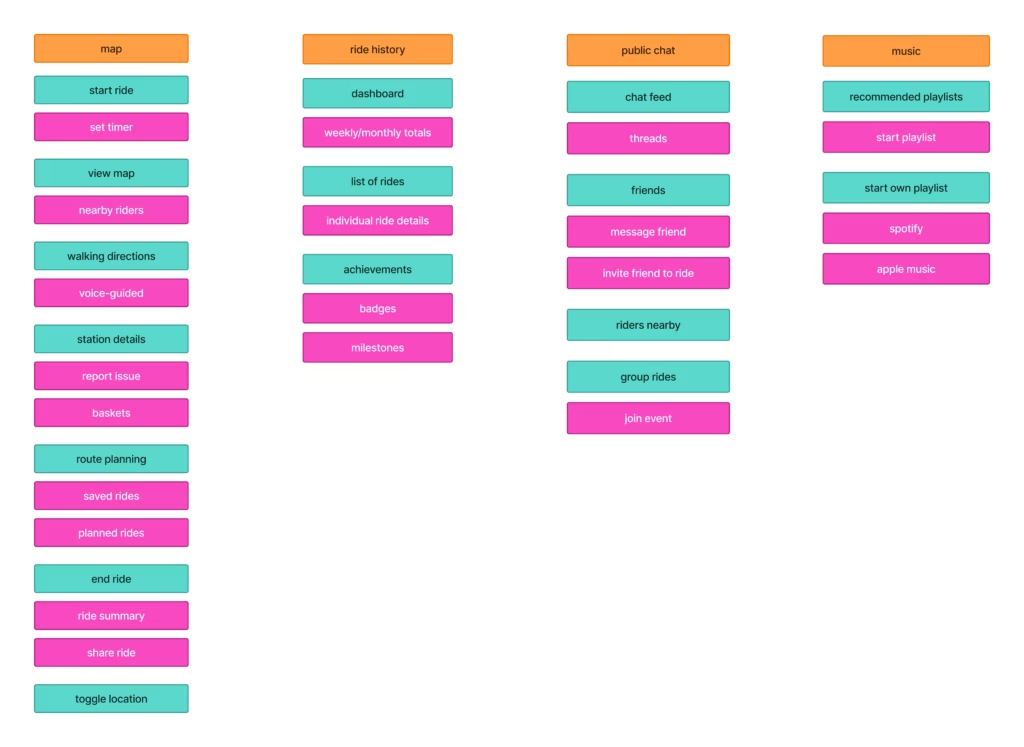
Information architecture showing three levels of navigation: main tabs (orange), section content (teal), and sub-sections (magenta).
Sitemaps
These sitemaps highlight the primary user flows within the app prior to low-fidelity wireframing.

Sitemap Key
Signing Up For The App
user needs
upfront, quick payment
ability to pay per ride without saving card details


solutions
step-by-step input to reduce errors during sign-up (supports smooth onboarding)
optional payment setup with the ability to skip and pay per ride (directly ties to both needs)

Locating a Station and Renting a Bike
user needs
quick station discovery
seamless mobile booking
ride timer


solutions
map as primary entry with nearby stations displayed
clear station details before confirming the station
early confirmation of key decisions to reduce backtracking
optional ride timer is placed after booking to avoid slowing core flow

Saving a Station and Viewing Saved Stations
user needs
saved stations feature
quick station discovery


solutions
ability to save stations directly from the map
single decision point to quickly save a station
return to home screen without losing content

Low-Fidelity
Design Decisions
- progress indicator to guide users through sign-up
- clear primary vs secondary buttons to support quick decisions
- basket indicators to help users choose the right bike
- star icon for quick action saving
Signing Up For The App

Locating a Station and Renting a Bike

Saving a Station and Viewing Saved Stations

Test and Implement
Usability Testing
A moderated usability study was conducted on low-fidelity paper prototypes to test how well primary flows could be completed.
This was tested on 3 participants, 2 of whom could be classified as The Business Person, and 1 as The Tourist.
| TASK | SUCCESS RANKING |
|---|---|
| Create an account with Miami Bike | 100% |
| Locate a station and rent a bike | 100% |
| Save a station and view saved stations | 66.7% |
Key Findings
- “I love the sign-up form! It’s fast, and I can see the steps”
- Users were confused when met with the option “display last name” during sign-up
- Users didn’t know what would happen if they chose “No Thanks” for payment and location settings
- When users were met with the QR code, they were unsure what to do next
- The star icon for saved stations caused occasional confusion
Design Iterations
- Removed the option to display a last name to reduce confusion
- Renamed “No Thanks” to “Pay at Kiosk” to clearly communicate the alternative action and reduce ambiguity.
- Added clear instructions explaining how and when to use the QR code at the station
- Replaced the star icon with a bookmark icon to better indicate saved stations
Design
V.1
Design Insights
Signing Up For The App
- Dark(er) grays tend to indicate that something is disabled
- The ride timer was added to this flow instead of in the Renting a Bike Flow
- This reduces the repetition of setting a timer each time you rent a bike
- “No, Don’t Enable Alerts” assumes permanent intent and uses guilt-based wording
- “Subcopy gives good context, but will everybody read it?”


V.1
Design Insights
Locating a Station and Renting a Bike
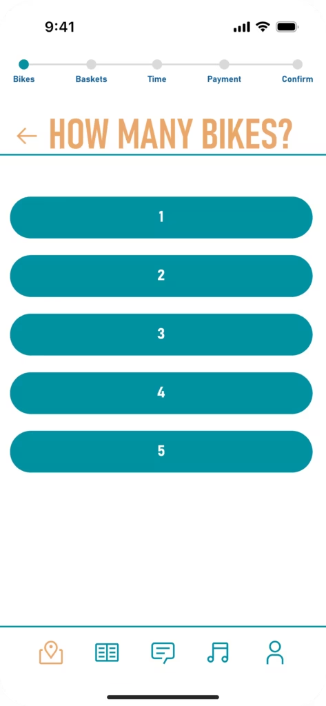
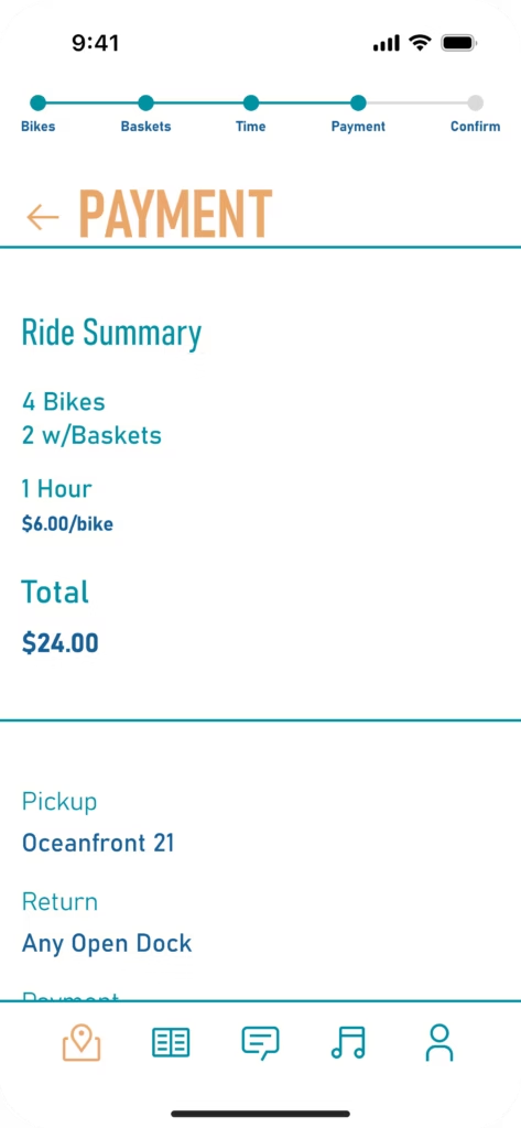
- “Can I explore a different layout for choosing how many bikes?”
- Heading/information color and size work for readability, and should be consistent in other areas of the app
- The progress bar should move underneath the headings to follow common UI patterns
V.1
Design Insights
Saving a Station and Viewing Saved Stations
- Colors of Miami are used to create the local app feel
- Orange did not pass color contrast and needs to be changed
- Map screen could show more of the map
- “Can icons be used for station details?”
- “Should there be an image of the station?”


Problem Framing
The journey to Version #2, the Final Version, started off with HMW’s to guide new iterations. So, how might we…
- improve the colors, but have them still be representative of Miami?
- change form fields to feel more intuitive?
- encourage more play into the designs?
Test
Usability Testing
Let’s test again with the same tasks as before!
This was tested on the same participants as before, adding 1 new participant who could be classified as The Business Person.
| TASK | SUCCESS RANKING |
|---|---|
| Create an account with Miami Bike | 100% |
| Locate a station and rent a bike | 100% |
| Save a station and view saved stations | 100% |
Key Findings
- “Why can’t I search for stations? I guess I’ll just pinch around on the map”
- Users found the confirmation screen information unclear: how many total bikes are there?
- Users wondered how much time they had to scan their QR code, what if they were a 30-minute walk away? Would it expire?
- Users wanted to know where the basket on the bike would be
- “I am never confused on what button to push!”
Implement
Let’s Iterate
After prioritizing what changes are most important to solve our user goals, we can begin to iterate on what will solve these problems.
What changed?
adding search tool
total bikes information
adding a time limit
re-accessing QR code
basket information


what was accomplished?
flexible station search
clearer understanding
timely bike pickup
easy QR code access
supports trip planning
Additional Changes
- Removed non-essential features (music and public chat) based on stakeholder feedback and usability feedback to prioritize core user needs
- Public chat would lead to a higher risk of user misinformation
- Music is a feature that could be revisited later, but for now, it doesn’t pertain to user needs
- Replaced public chat with “Support”
As I was iterating to solve issues with usability testing, I also went through and solved the problems noted in Version 1, which can be seen in the images below.

This…

This…

This…

Became This!

Became This!

Became This!
Design
V.2
design decisions
Signing Up For The App
- The form field is no longer a negative affordance
- The space between the checkbox and the text decreased to help the Law of Proximity
- Subcopy text across all screens became shorter and bigger, helping with readability
- Shortened centered text to 2 lines to not overwhelm users
- Icon usage for enabling alerts and location for familiarity


V.2
Design decisions
Locating a Station and Renting a Bike
- Created a biking illustration, making the experience feel less transactional and more enjoyable
- This also helps build on the brand, making it different from generic transportation apps
- Utilized the first dimension of UX design
- Defined a reservation time limit to balance user convenience with system availability.
- This prevents bikes from being held too long, ensuring fair access for all users
- Added a “Cancel Reservation” option since users might get frustrated if they have to wait for a refund to get their money back
- On all map screens, users can now filter for stations with bikes
- This creates a faster way to see which stations have bikes, helping The Tourist target audience


V.2
design decisions
Saving a Station and Viewing Saved Stations
- Replaced orange with coral, which is still representative of Miami’s colors. This maintains the local feel of the app
- Supporting icons reduce cognitive load by pairing visuals with text, helping users make faster decisions when selecting a station
- An image of the station helps users see the station beforehand, so they know what they are looking for
- Buttons were relabeled with specific actions to clearly communicate what happens next


Ideate: Additional UX Considerations
Location Access Disabled
Let’s say a user decides not to allow their location during sign-up. When they open the app, what will be different for them versus people who allow their location? How will the interface change?
Solution: “Enter zip code or city” shows in the search bar when you open the app; this caters to both The Business Person and The Tourist; locals would be more comfortable with zip codes, and tourists would likely just search by Miami cities (still needs to be tested ). This maintains momentum through the app.


No Payment Method Saved
During sign-up, a user chooses not to save their card upfront. How would this change the process of them renting a bike?
Solution: The confirmation screen shows more distinct sections, allowing quick verification of payment details.


QR Code Expired
As mentioned earlier, users have 10 minutes after reserving their bikes to pick them up. What happens if someone doesn’t get to the station on time to unlock their bikes?
Solution: Upon opening the app, the user would see a pop-up notifying them that their reservation had expired.

Received a Broken Bike
Imagine a user is unlocking their bike at the kiosk only to find that when they try to pull out their bike, there’s a flat tire. How will users be accommodated if they have bike issues? Would there be a first-time incentive to keep riding?
Solution: The user would be provided with two recovery options (refund or find a nearby station) to maintain satisfaction. The incentive rebuilds trust and improves the experience after a service failure.


Implement: Handoff
V2. Final Version
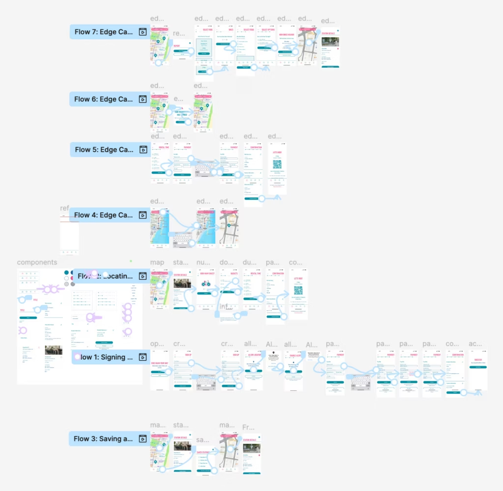
Each flow had its own handoff file where details were explicitly documented. The example below shows a portion of Step 1’s handoff file.

Outcome
Reflection
If this project were to continue, I would think about integrating more play into my designs. For example, the station details overlay could benefit from a grid layout with large numbers. This visual engagement would cater to The Tourist and bring this segment of people’s needs front and center, like The Business Person’s needs already are.
From this project, I learned that while icons can be smaller, they must have an adequate touch target around them. I used a 44×44 px touch target on all clickable icons to help improve tap accuracy. I also learned to utilize iOS UI libraries not just for status bars and keyboards, but also for confirmation messages to create a realistic app.
Next Steps
Next steps include advancing Miami Bike to a full app and testing it with real locals and tourists in Miami to further validate our decisions. Continuing to refine the navigation will help stakeholders better understand the updated information architecture. From there, supporting handoff and future iterations will be important to make sure the designs carry through clearly into the final product.