

Overview
This project explores a responsive website design for a landing page and technical page. It focuses on reducing uncertainty and increasing trust with Omni’s AI-powered cars and potential users. This website was built to increase Omni bookings (through Uber).
Role
UX Research
UX/UI Design
Responsive Website Design
Tools
Figma
FigJam
Photoshop
Illustrator
Deliverables
Omni’s Visual System
Final Design of Omni’s Desktop and Mobile Landing Page
Final Design of Omni’s Safety Standards and Emergency Handling Page
Empathize
Business Context
Omni recently launched its autonomous vehicles through Uber. Frequent ride-share users have become aware of the brand, and early customer loyalty has positioned Omni in strong competition with other autonomous vehicle companies.
While Omni’s launch through Uber was successful, many users still hesitated to book autonomous rides through all autonomous car companies. As a result, Omni did not meet their projected demand.
Product Opportunity
Hypothesis
I initially thought that cost and AI being a new, emerging option were the reasons preventing the use of driverless cars.
Findings
However, my insights demonstrated it wasn’t the cost at all, and AI being new wasn’t the main problem. Instead, it was a lack of reliable and consistent safety information online.
This Resulted In…
Onmi’s designs took this research into account to be able to find what will make them stand out against competitors and increase their clients.
| Success Metrics | Target |
|---|---|
| Increased Ride Bookings | 15% |
| Faster Navigation to Key Information | 30% |

My goal
- A landing page and technical page will let users read simple safety information on autonomous vehicles
- This will inform people who are hesitant about using AI for transport to trust Omni by ensuring that their services are even safer than traditional transport
- Task completion in usability studies, as well as an increase in bookings, will measure effectiveness

methodology
To truly connect with users, I sat down and wrote out what truly mattered to people when choosing a method of transportation. By taking the time to consider pain points and user needs, I dug into the small details that still matter.

Common themes
- People don’t have a place to go to find information about AI safety in transportation
- Users wished they knew all the features that Omni has
- Users don’t want to waste time looking at safety guidelines they don’t understand
Understanding the Audience

Paint point
distracted drivers
mixed safety messaging
uncertain safety standards
unclear emergency response


User need
attentive driving reassurance
consistent safety information
clear certifications
emergency handling clarity
Define
The Problem
Fear circulates around the safety of AI, preventing people from booking with Omni. Omni needs a way to build trust with people so they are more inclined to book.
Accessibility

clear hierarchy
Screen readers are supported while still solving the need for a consistent layout of safety information.

high color contrast
By running my colors through a contrast checker, I made sure that colors still portrayed Omni’s brand and weren’t distracting or difficult to see in different environments.

predictable navigation
The website navigation should be intuitive and lead users to the information they expect.
Constraints
Due to time restrictions, a usability study after low-fidelity prototypes was not conducted during this phase of the project.
Instead, critique from designers and feedback from stakeholders after the first iteration were documented. Additionally, a usability study on the high-fidelity prototype (V.2) was conducted to validate UX and UI decisions.
Ideation
Problem Framing
Before jumping into site goals, we need to start off with HMW’s to guide clear decisions. So, how might we…
- make autonomous vehicle safety easy to understand so users feel confident booking a ride?
- build trust in Omni by clearly communicating how the technology works?
- reduce hesitation by providing reassurance before and during the booking experience?
Site Goals
After empathizing with users, we continue ideation with site goals to guide the layout and decisions of our initial wireframes.
Site goals (business and visitor)
- visitor goal: book with Omni and book confidently
- business goal: build trust and communicate a safety-first brand identity
- visitor goal: navigate the site without needing to search extensively
- business goal: provides all the answers users want to know simply
Low-Fidelity
Design Decisions
Implementing site goals
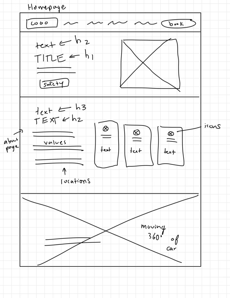
- booking with Omni is broken down into a simple step-by-step process
- icons to enable faster scanning of the values of Omni
- headings well-thought-out for quick learning
- visual and text elements are paired to simplify an information-heavy page




Design
V.1
Design Insights
Desktop Landing Page
- Safety Standards Page isn’t included to establish a visual system
- Purple usage should be used more purposefully
- Ex: Small separator lines shouldn’t be purple since they aren’t important
- Too many primary buttons! If everything’s important, nothing is important
- Omni is located in cities, but the page feels more futuristic than technical, which needs to be transitioned for user needs.
- Vertical headlines can be hard to read in terms of accessibility
- “Safety” button could mean many things; users need to know where that button will lead them
- Each section feels similar: can I implement different layouts that still feel holistic to the brand for each section?

Problem Framing
The progression to Version #2 started off with HMW’s to guide new iterations. So, how might we…
- use purple more intentionally to highlight key actions and important information?
- align the visual design with Omni’s real-world city context to build trust and clarity?
- make autonomous vehicle technology feel approachable rather than overly abstract?
V.2
Design Decisions
user need
attentive driving reassurance
consistent safety information
clear certifications
emergency handling clarity
design solution
visible system behavior
simplified safety standards
transparent safety certifications
clear emergency protocols
Functionality and UI Patterns
- Universal styling of information, utilizing the Law of Proximity to group content
- Strategic CTA placement encourages progression through the website and booking through Uber
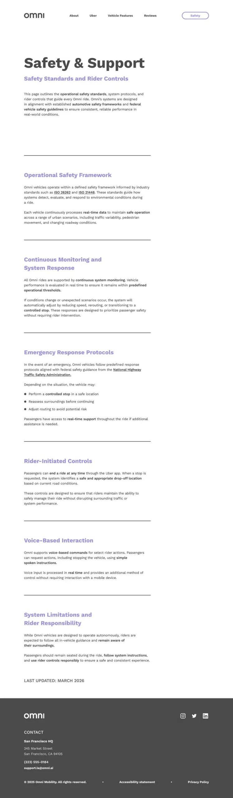
- Renamed “Safety” to “Safety Standards” to improve clarity and reduce ambiguity in navigation.
- Purple highlights only key messaging and calls-to-action, utilizing the Von Restorff Effect to draw user attention
- City map imagery is shown throughout the site to reinforce brand familiarity
- When hovering over cta’s, a black fill moves across the page, symbolizing a car moving through traffic
- Safety Standards page is intentionally “stripped,” not having as much imagery and interactions as the landing page, to keep the focus on technical information

Test
Usability Testing
Finally, an unmoderated usability study was conducted to test how well our user needs are front and center.
I conducted usability testing with 3 participants who had no prior familiarity with Omni but were experienced Uber users. Participants completed 5 key tasks, with success rates evaluated and insights synthesized through an affinity diagram based on their actions and feedback.
| TASK | SUCCESS RANKING |
|---|---|
| Find more about safety standards | 100% |
| Locate where Omni currently operates | 100% |
| Book a ride | 33% |
| Find what makes Omni safer | 67% |
| Contact Omni | 100% |
Key Findings
- Users didn’t like how they had to scroll so far down the page to book
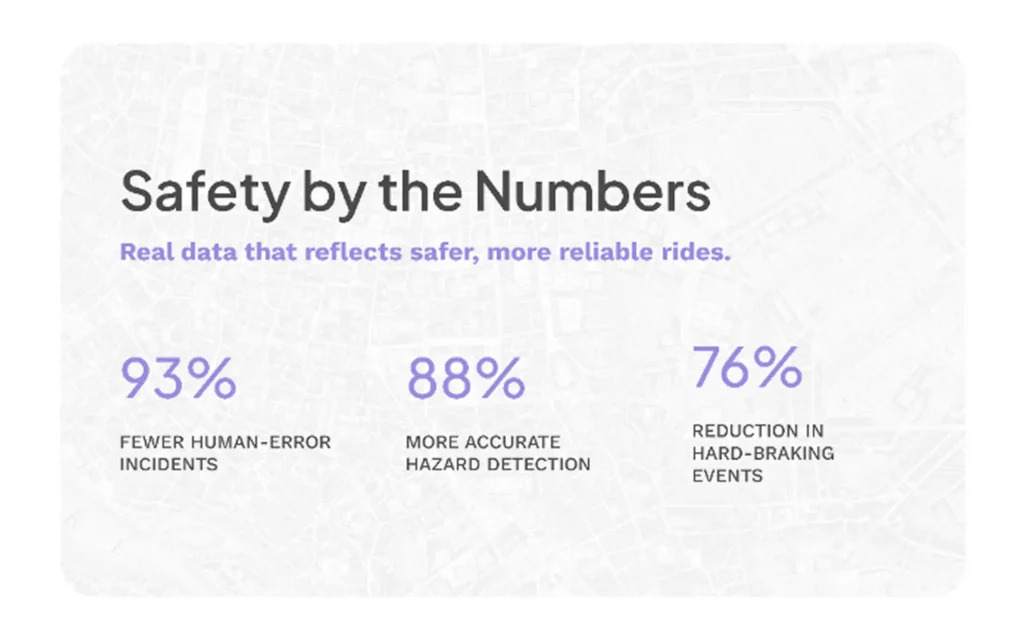
- Participants wished the statistics were compared to other ride-share options
- Users were confused by the Omni and Uber integration
- Users didn’t want to read all the text on the safety standards page
- Users appreciated that the safety standards page was simple

Implement
Let’s Iterate
After prioritizing what changes are most important to solve our user goals, we can begin to iterate on what will solve these problems.
Since it was discovered that most changes were not with the design but with the written content, I communicated with stakeholders to rework existing safety information.
What changed?
booking provided on homepage
Omni vs. other vehicles
Uber talked about more
less text


what was accomplished?
less scrolling to book
how Omni benefits riders
clearer understanding of Omni
easier to scan

This…
This…

This…

This…

Became This!

Became This!

Became This!

Became This!
Implement: Handoff


Outcome
Reflection
More time to research the target audience could greatly benefit this website by making the product more flexible and increasing revenue. This could include exploring a persona of a non-youth audience that has never used AI before.
I also had an idea of incorporating more imagery of people into the homepage design, to cater to the audience’s need for the site to feel more friendly. While my Final Version took into account being friendlier by adding more city imagery and different layouts, images of people could help users better envision themselves using the product.
Overall, I learned that not every content section needs the same layout to remain understandable. Using different layouts across sections helps maintain user interest while clearly separating distinct topics.
Next Steps
After doing a QA of the site, the next step would be handing off the final designs to engineering for development. After launch, stakeholders could monitor booking rates and gather user feedback through surveys to identify opportunities for future improvements.